Bodoni: The Triumph of Elegance
Bodoni represents a series of typefaces designed by the Italian printer, typographer and type designer Giambattista Bodoni in the late eighteen and early nineteen century (1765-1813). In his work, Bodoni was significantly influenced by the ideals of John Baskerville as well as his contemporary and rival, Firmin Didot.
His style emerges in the time when technological advances and higher quality of punches allowed for crispier strokes with extreme contrasts. His aim was creating typography that impresses the eye and is meant to be appreciated as a work of art. His credo for what constitutes good typography we stated in his seminal work Manuale Tipografico as: “A type face will, therefore, be all the more beautiful the more uniformity, crispness, good taste, and elegance it possesses.” With Bodoni types, he indeed achieves these ideals, although quite often at the expense of readability.

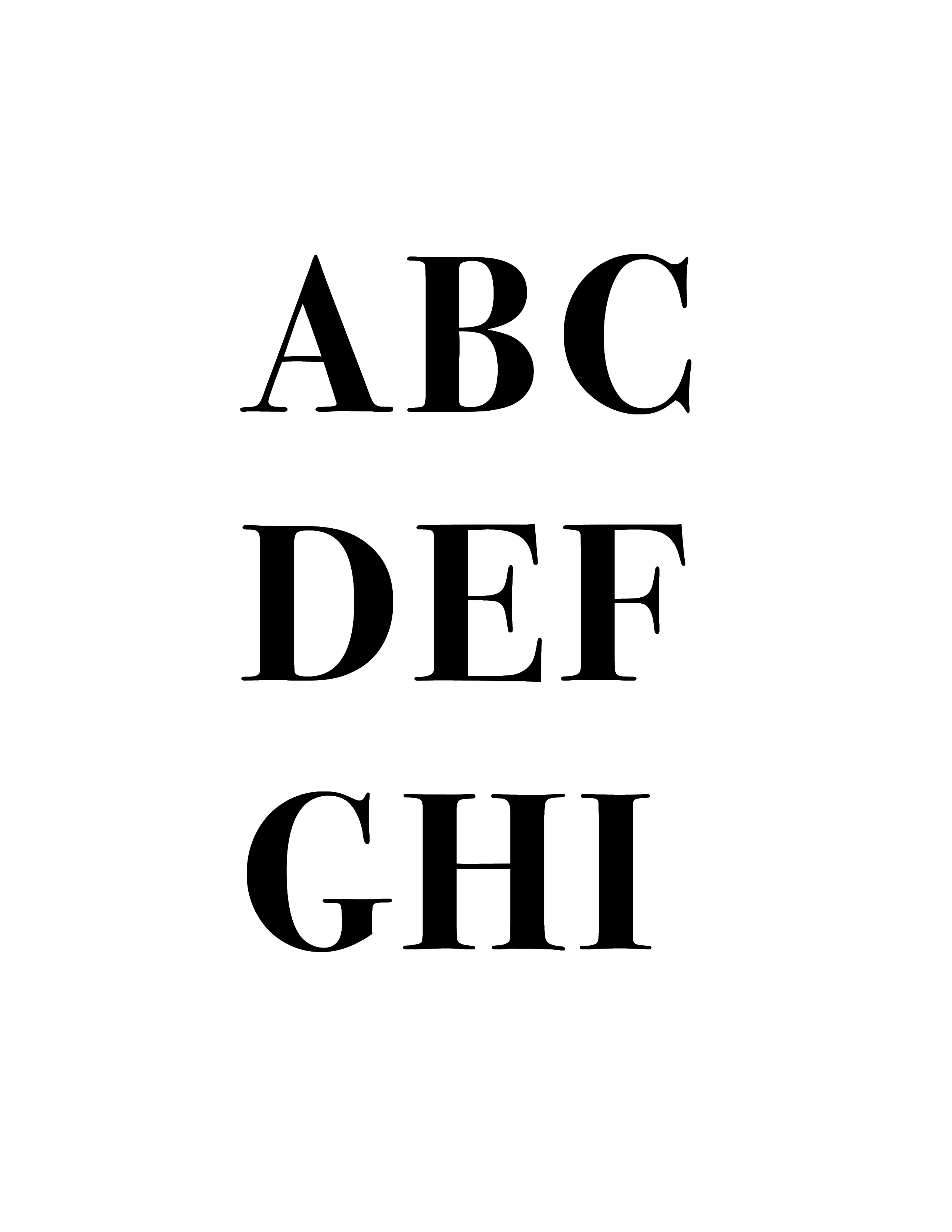
Bodoni is usually classified as a “Modern Roman” or Didone Serif type, and its typical features include exaggerated stroke modulation, abrupt hairline serifs, ball terminals, high contrast and small aperture. While commonly compared to Didot, Bodoni’s weight transitions are more gradual, and some of it’s earlier designs still maintain a certain degree of bracketing, characteristic of “Transitional” types. Typical of a Modern typeface, its features also include symmetric forms of the counters of the “o” and “d.” It’s highly recognizable feature is the fact that the tail of “Q” is centered under the counter of the letter.
Due to its small X-Height, strong stroke contrast, and abrupt weight changes, Bodoni can be quite disruptive to the reading process and as such is might not be an appropriate choice for the body text, but it’s particularly well suited for title fonts and logos.
[ Links ]
[1] “Bodoni”, Wikipedia, https://en.wikipedia.org/wiki/Bodoni
[2] “Giambattista Bodoni”, Wikipedia, https://en.wikipedia.org/wiki/Giambattista_Bodoni
[3] “Bodoni: Manual Of Typography”, Taschen; Har/Bklt M edition (October 1, 2010)
[4] “Bodoni: an inside look”, http://nathangitter.com/Bodoni.pdf
[5] “Robert Bringhurst, The Elements of Typographic Style”, Hartley & Marks Publishers, Fourth Edition (version 4.1), (2015)
[6] “Bodoni Font Family”, Fonts.com https://www.fonts.com/font/linotype/bodoni